web app design
United Consultant Dashboard
Complete UI Redesign for UX Improvement
Context
SaaS · B2B
Timeline
Sep 2024 · 2 weeks
Services
Website Design
Background
United Consultant, a USA-based SaaS company, approached us to revamp their existing dashboard. The project was initiated following an insightful discovery call with Saeed, the co-founder, who recognized the need for a significant user experience upgrade.
initial version of united consultant dashboard look and feel
Project Objectives
Elevate the aesthetic appeal and usability of the interface for all user segments
Establish and maintain consistency across fonts, components, and UX patterns
Optimize the information architecture for improved navigation and comprehension
Modernize the UI design, emphasizing cleanliness and contemporary design principles
Understanding the Why
My process begins with a deep dive into the 'why' behind design needs. After a swift but thorough analysis of the current designs, I identified significant opportunities to elevate the dashboard experience.
Key Findings:
User-Centric Design: Our target users, aged 40-65, have varying levels of technological proficiency. The interface must be simple, intuitive, and highly accessible.
Visual Consistency: Address and rectify inconsistencies in spacing, typography, color palette, and other UI elements.
Pattern Establishment: Develop consistent patterns for repetitive user journeys, reducing the learning curve and enhancing overall usability.
Double Diamond Design Process
To streamline my workflow and maintain focus on core project objectives, I developed a custom Figma template. This template facilitated the implementation of the Double Diamond design process, which consists of 4 key phases:
Discover: Competitor analysis • User research • Moodboards
Define: Problem framing • User personas • User flows
Develop: Idea generation • Wireframing • Prototyping
Deliver: Design iterations • Usability testing • Developer handoff
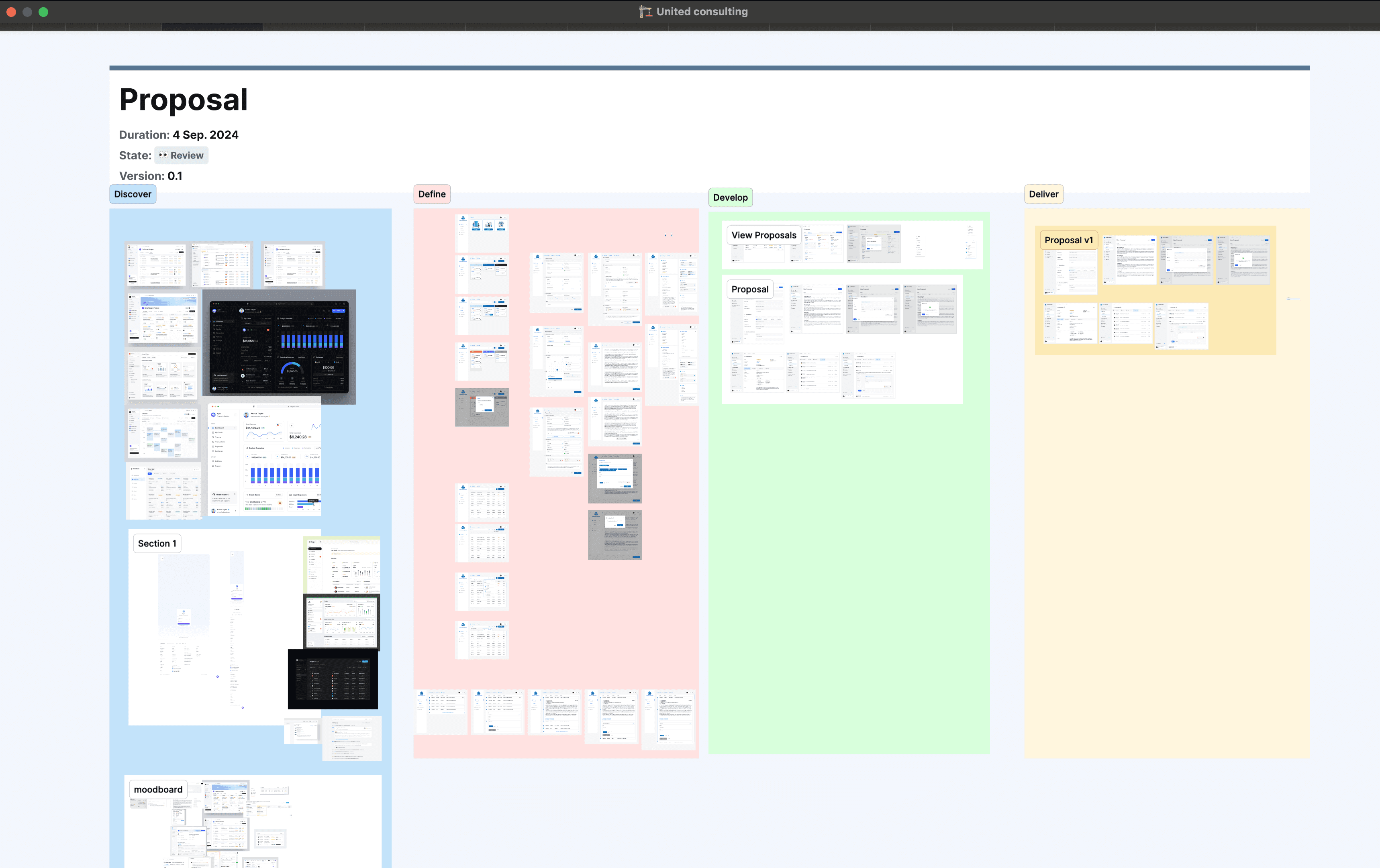
My Figma page structure for each user flow
While the full process is comprehensive, I adapt it to each project's unique needs. Given this project's tight deadline, I focused on high-impact, low-effort methods within each phase to maximize efficiency.
Flow 01: Find Citation
Objective: Enable the company to monitor driver citations effectively, facilitating performance-based decision-making.
Current Design Analysis:
Information Redundancy: The existing design didn't align optimally with business requirements. Users needed to compare citations bi-weekly within a specified timeframe.
Performance Metrics: Identify drivers with the highest citation rates and their severity status (Level of gravity).
Data Exploration: Introduce filtering capabilities to the employee detail page for easier data navigation.
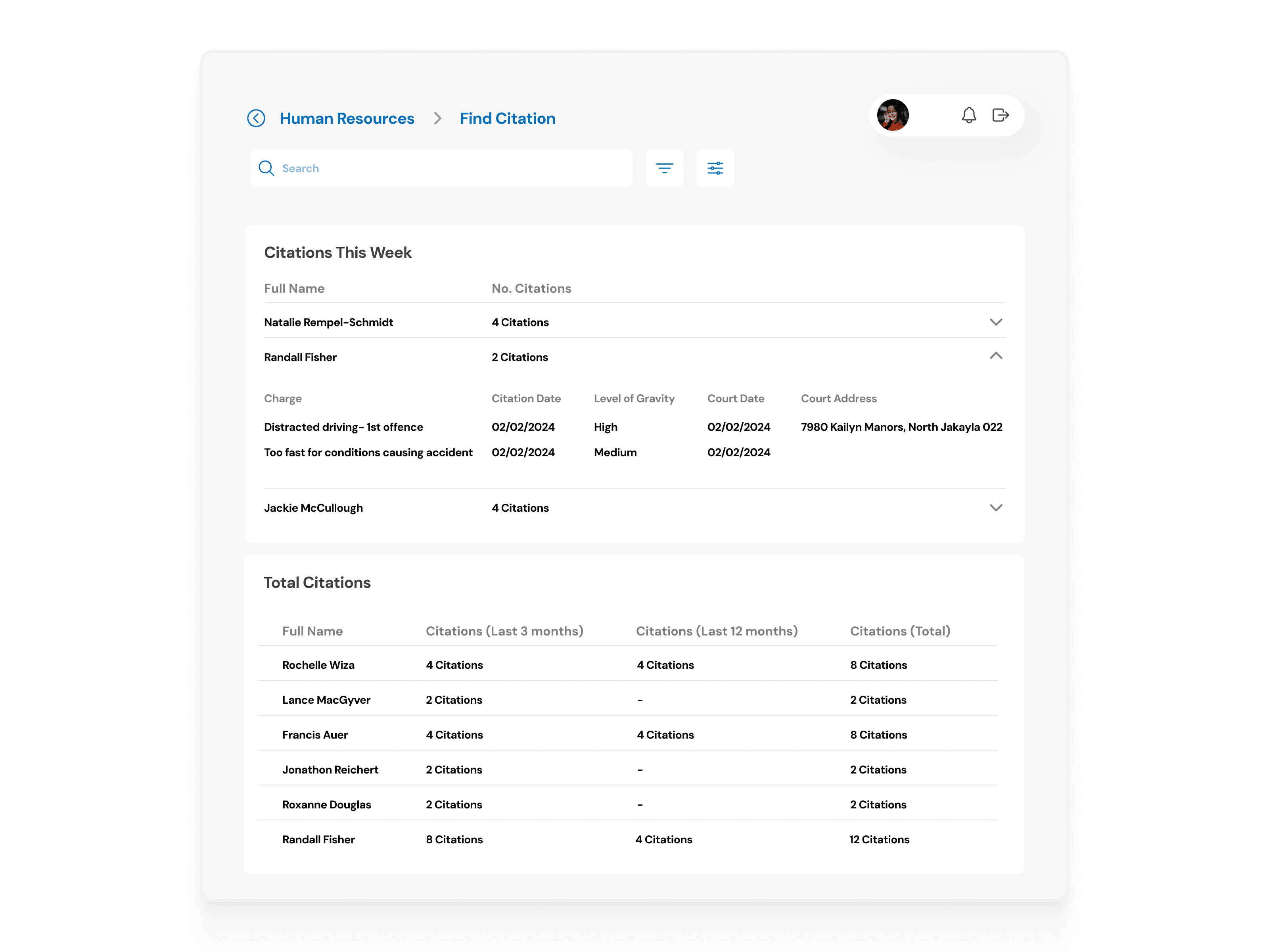
Find Citation, before redesign
Proposed Solutions:
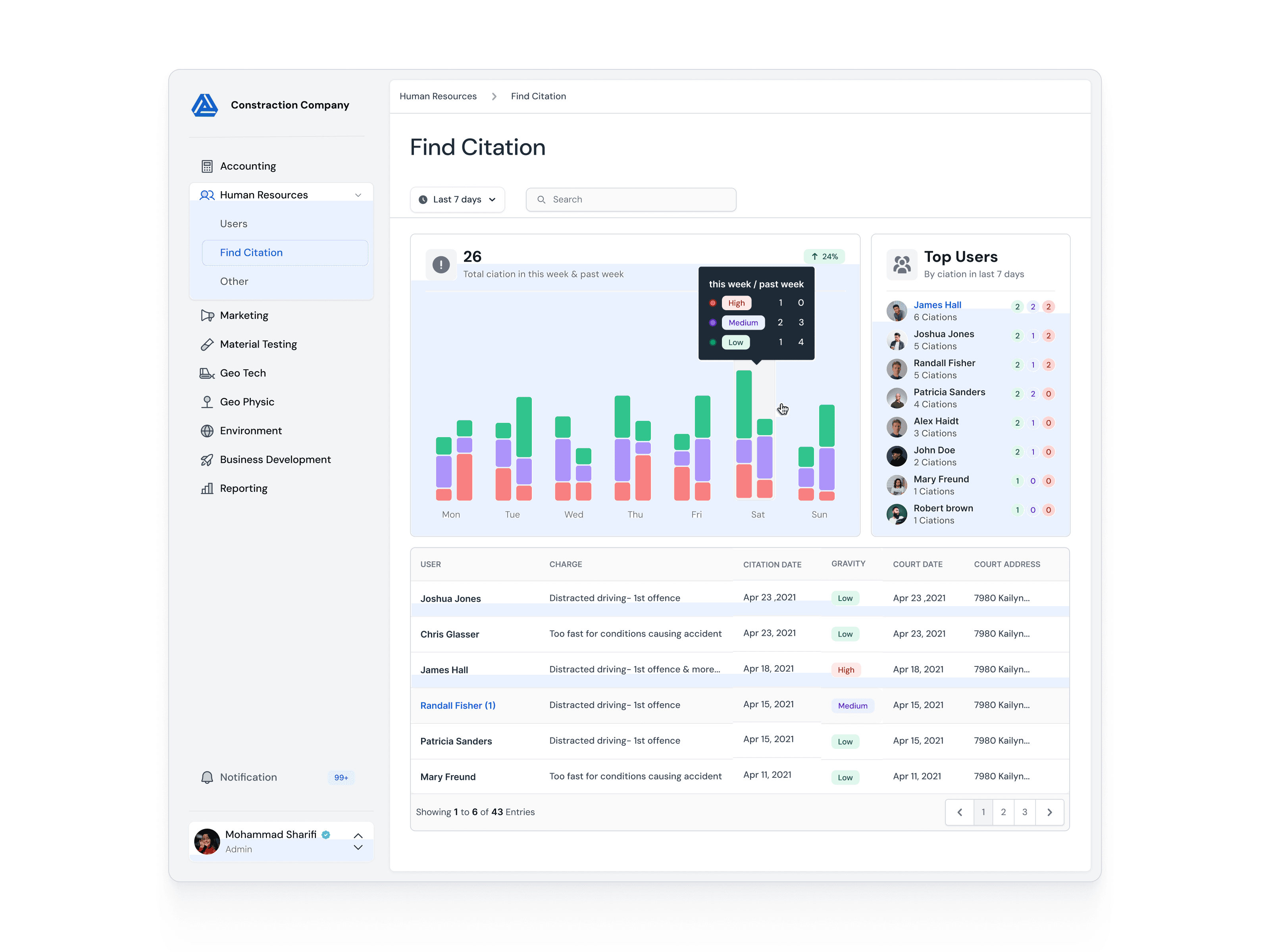
Data Comparison Enhancement: Introduced a color-coded weekly bar chart, allowing easy comparison of citations across different time periods and severity levels.
Improved Information Hierarchy: Implemented a "Top Users" section and reorganized the citation table, reducing repetitive information and highlighting key data points.
Enhanced Filtering Capabilities: Added a time period filter and search function, facilitating easier data exploration and analysis for specific employees or time frames.

Find Citation, after ✦ redesign and solving issues

Find Citation, Employe detail ✦ redesign
Flow 02: Proposal
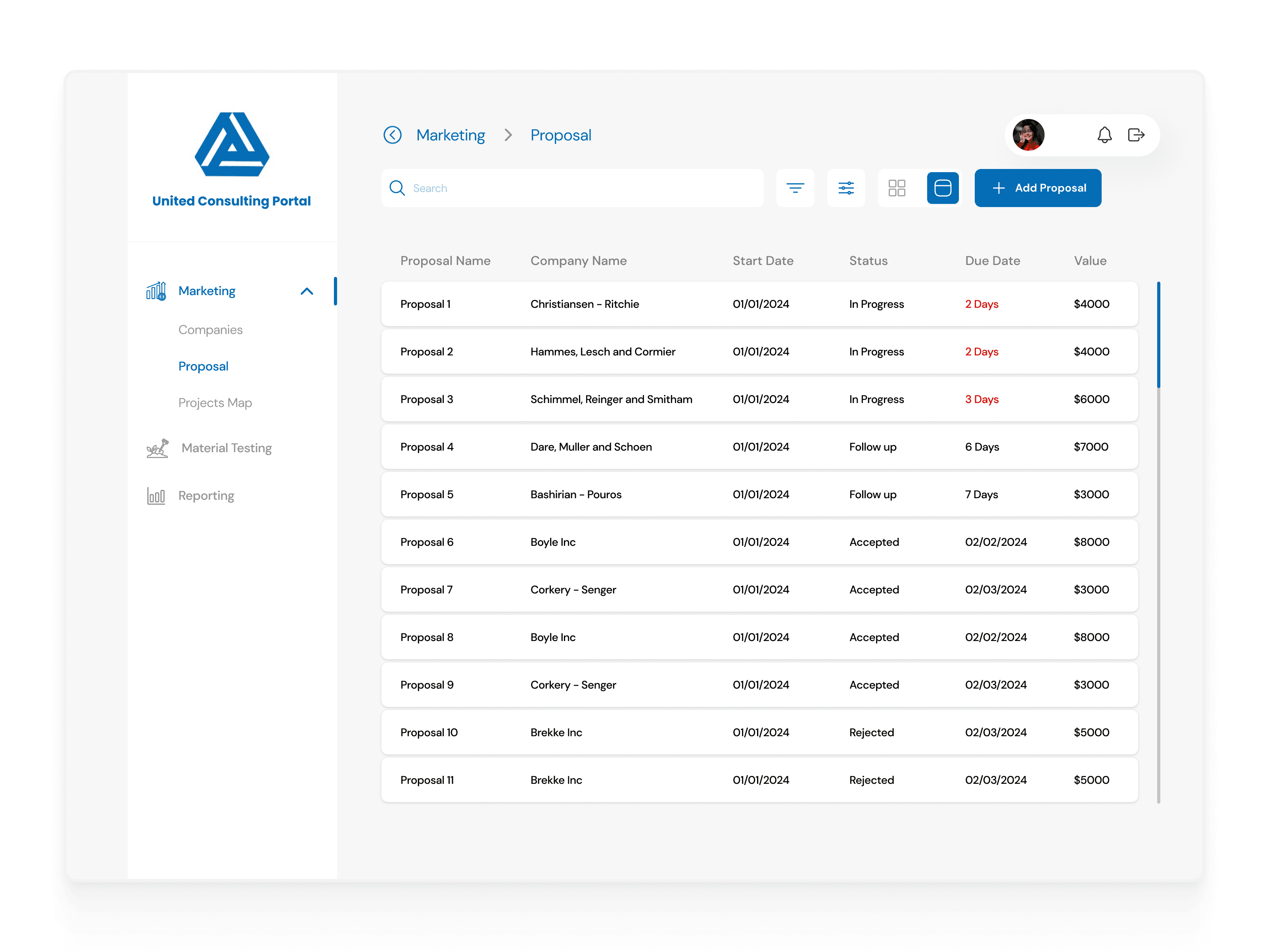
Initial version of proposal list (table view)

Proposal List (table view) after ✦ redesign
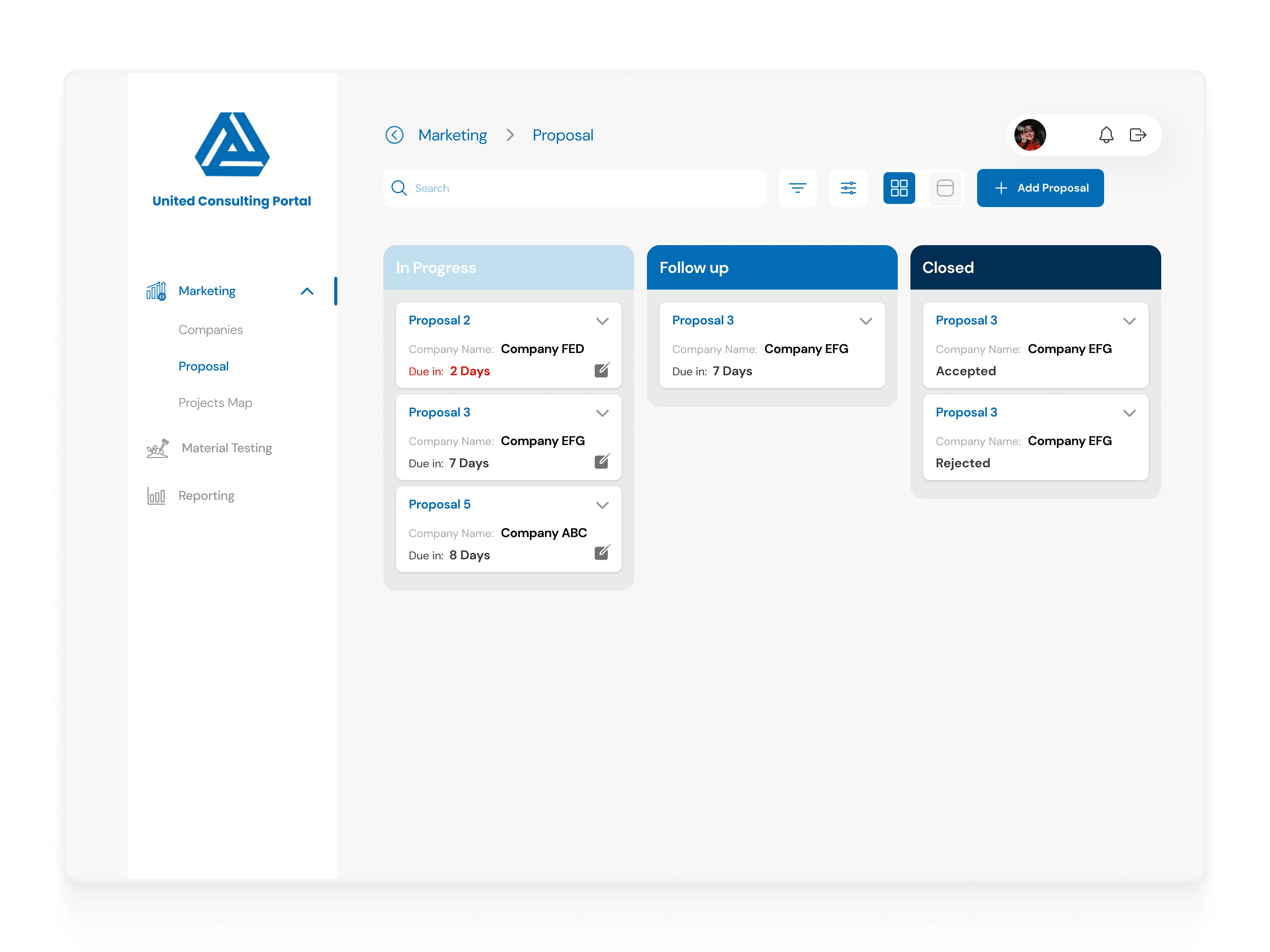
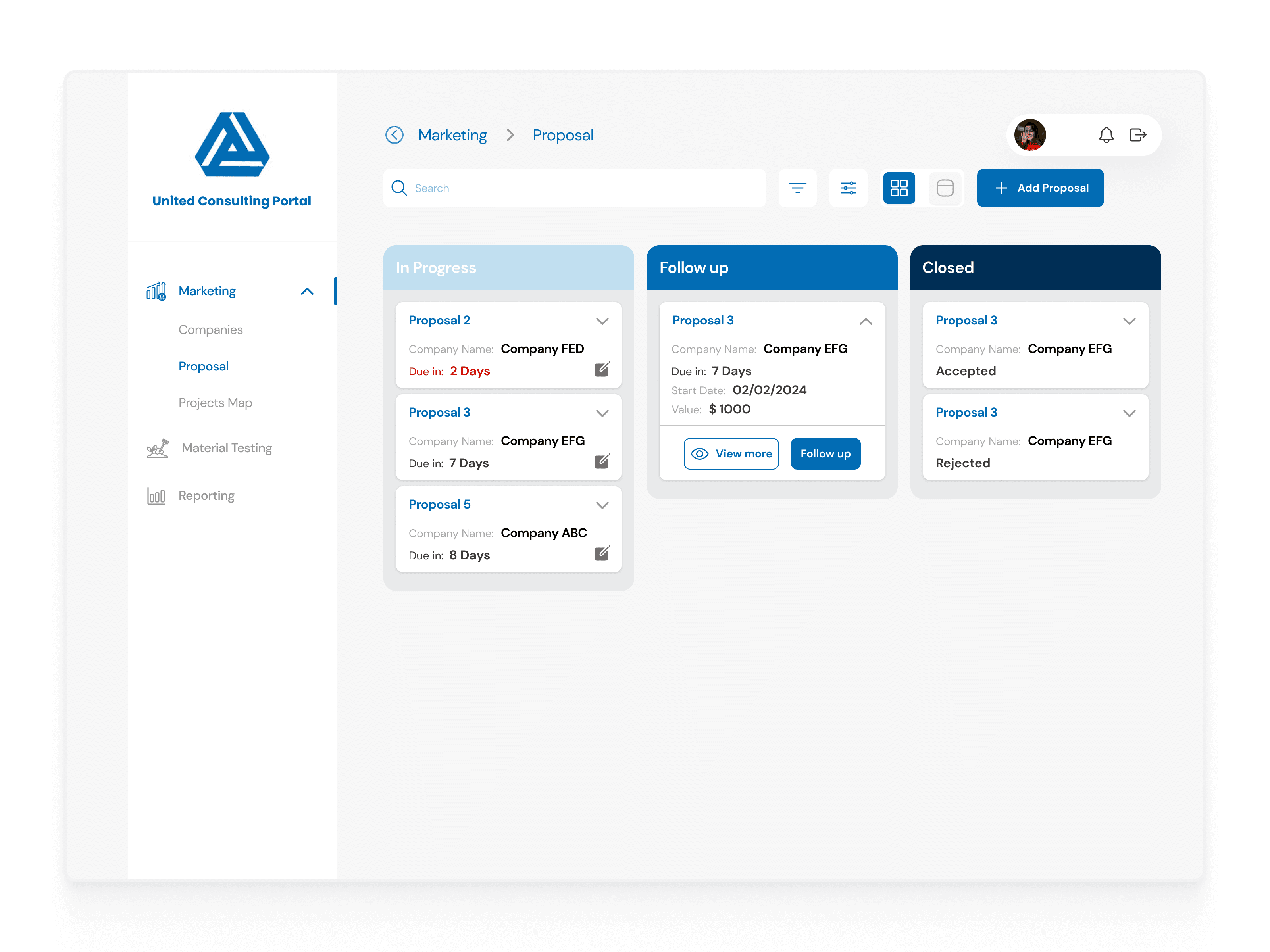
Initial version of proposal list (kanban view)

Proposal List (table view) after ✦redesign
Proposal Detail Page
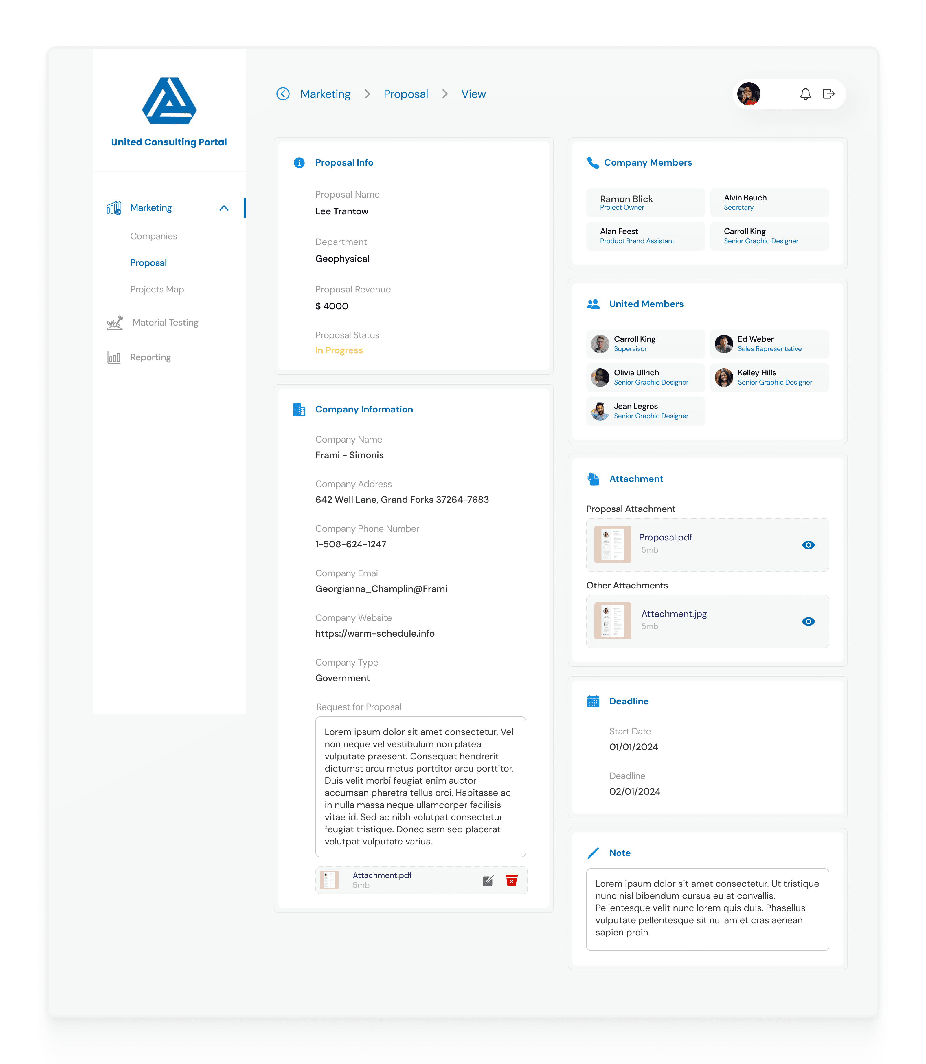
Initial version of proposal detail page

✦ Redesigned version of proposal detail page
Follow up a proposal
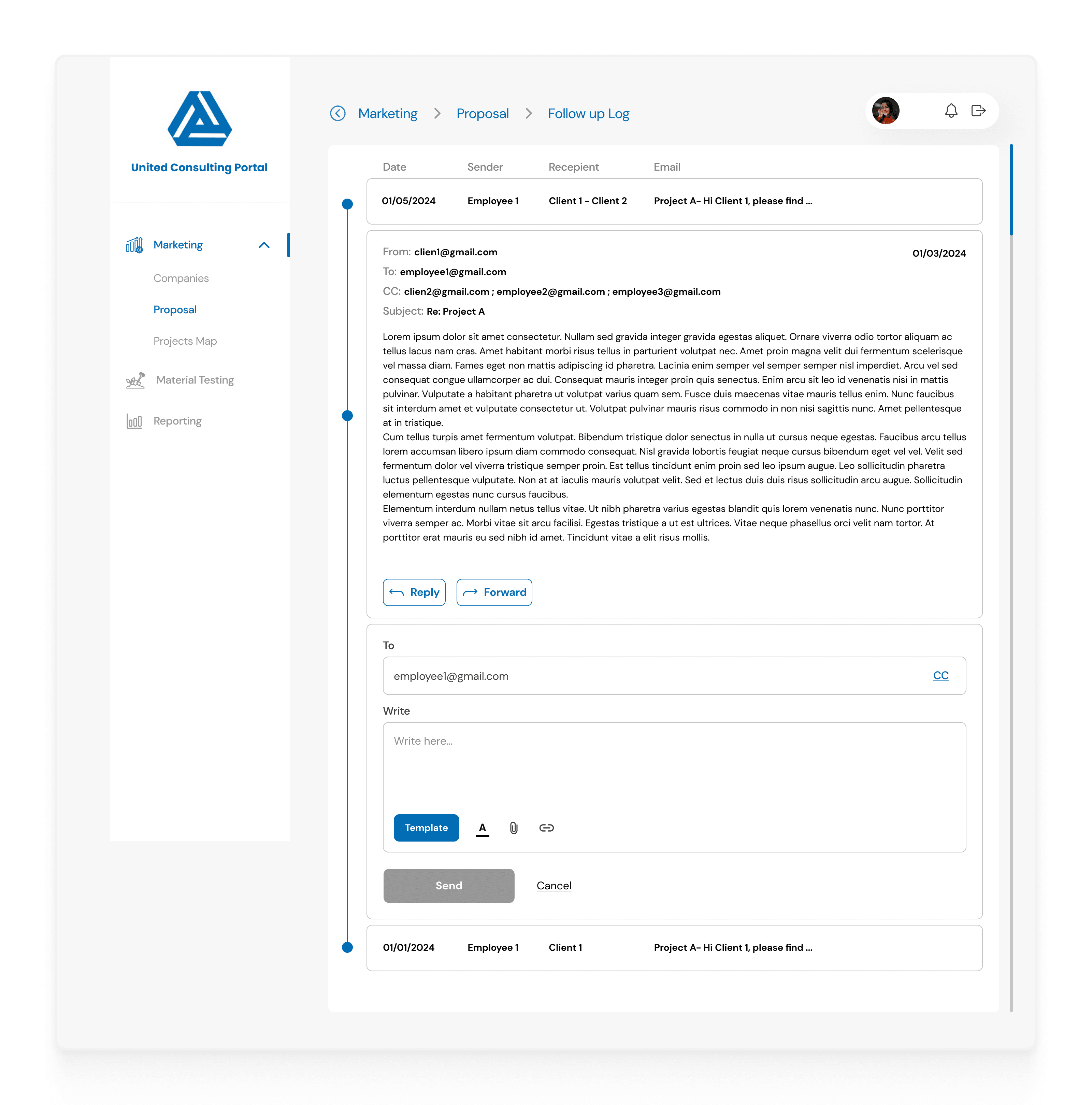
Initial version of proposal detail / Follow up

✦ Redesign version of proposal detail / Follow up
New Proposal

Initial version of new proposal
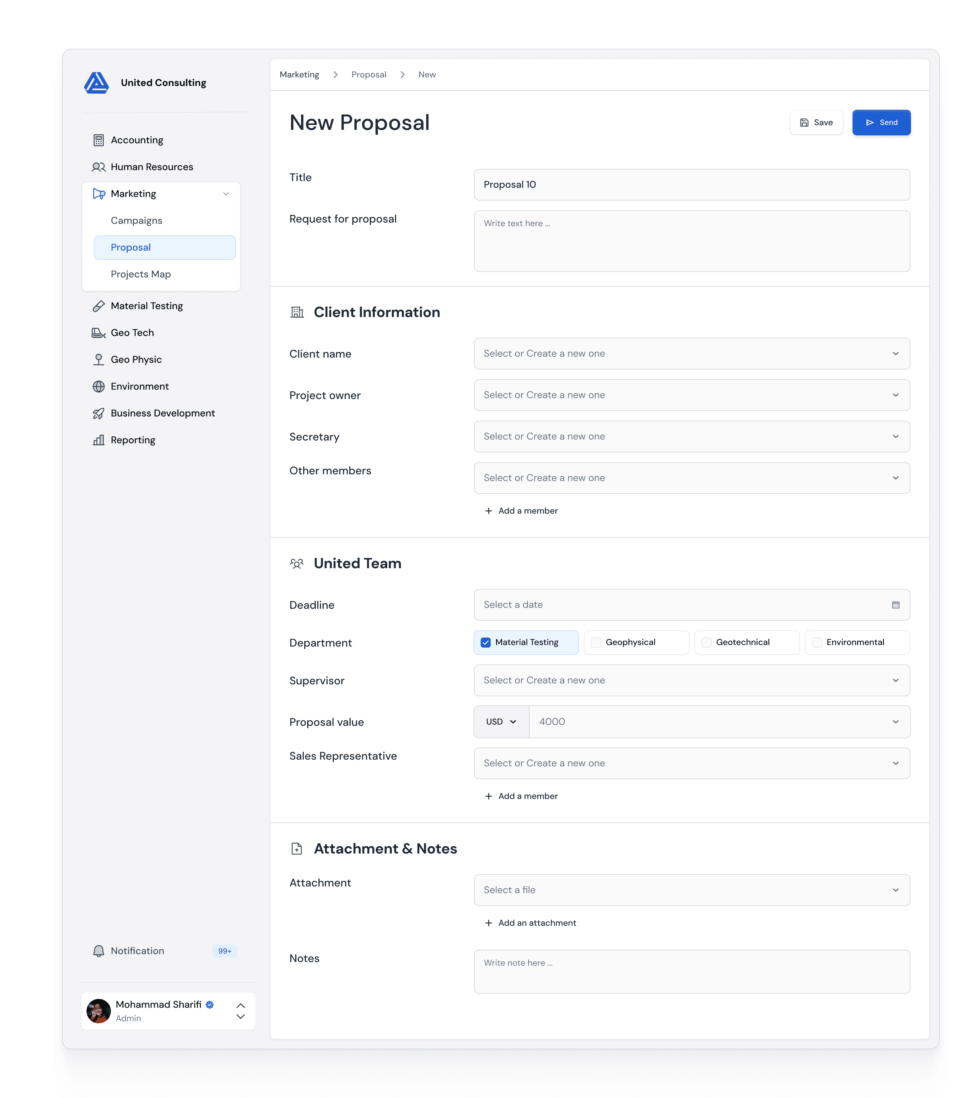
✦ Redesign version of new proposal
Flow 03: Material Testing
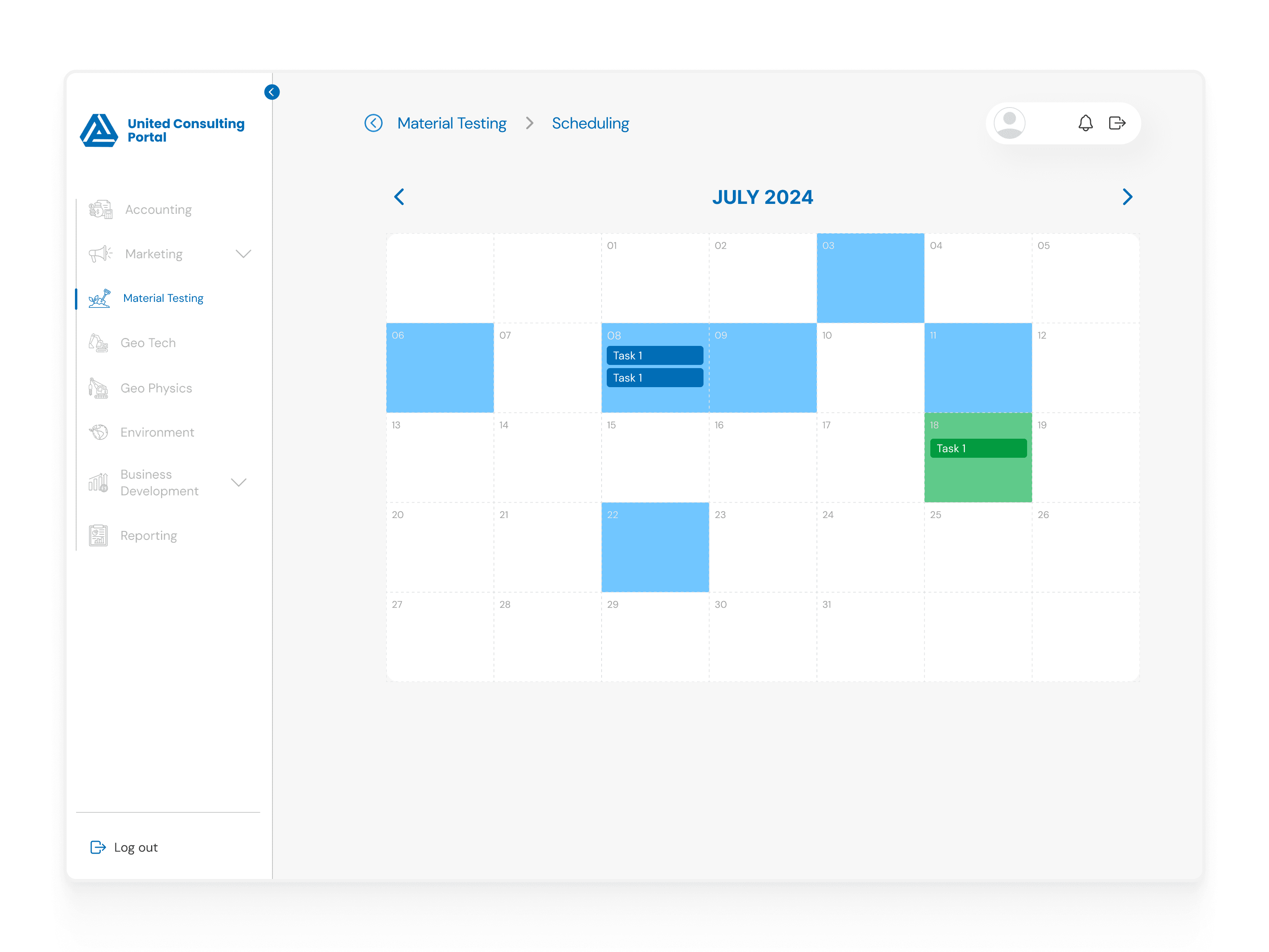
Initial version of Material Testing (calendar view)

✦ Redesign version of Material Testing (calendar view)

Initial version of Material Testing (assign/list view)
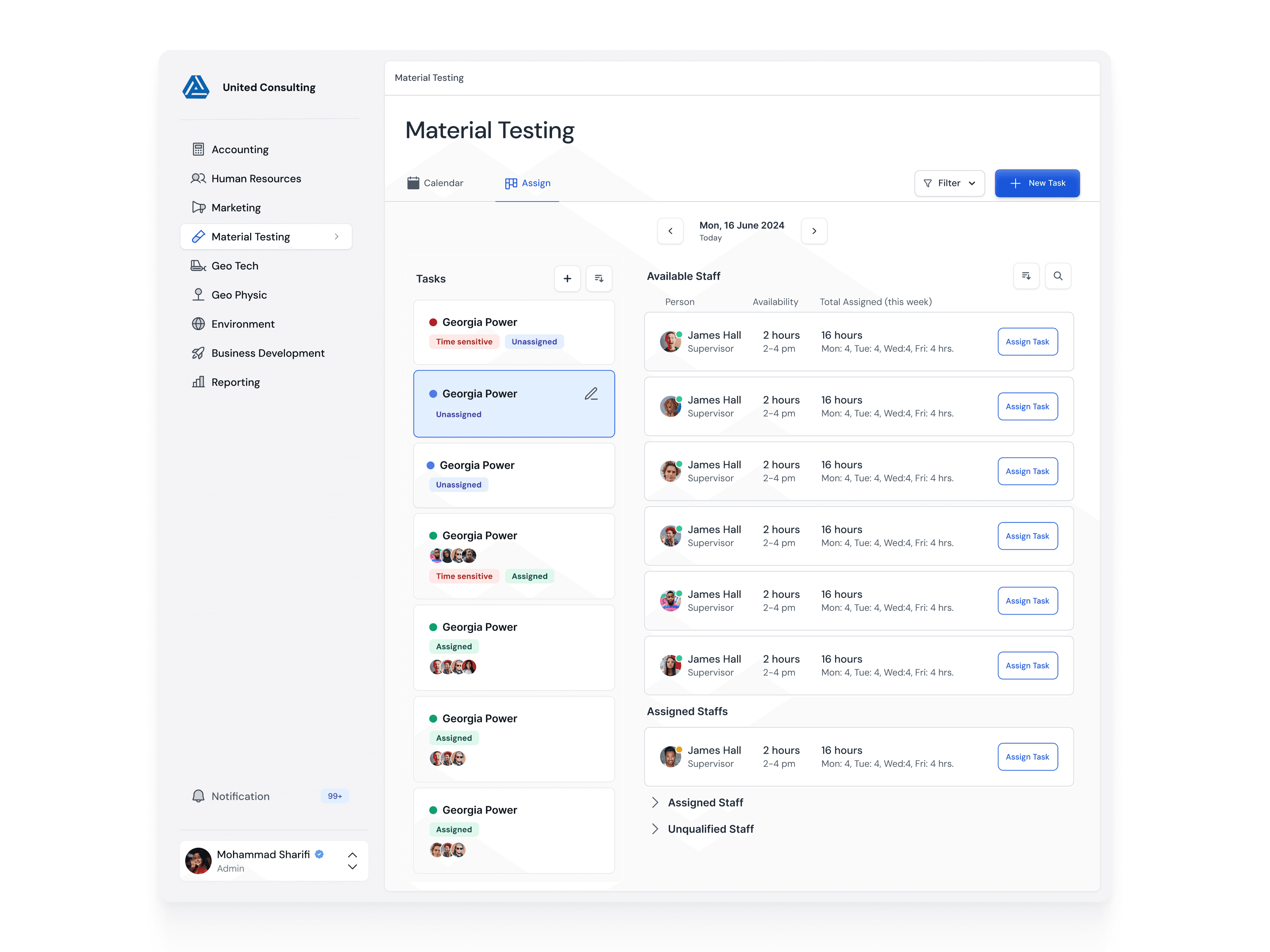
✦ Redesign version of Material Testing (assign/list view)

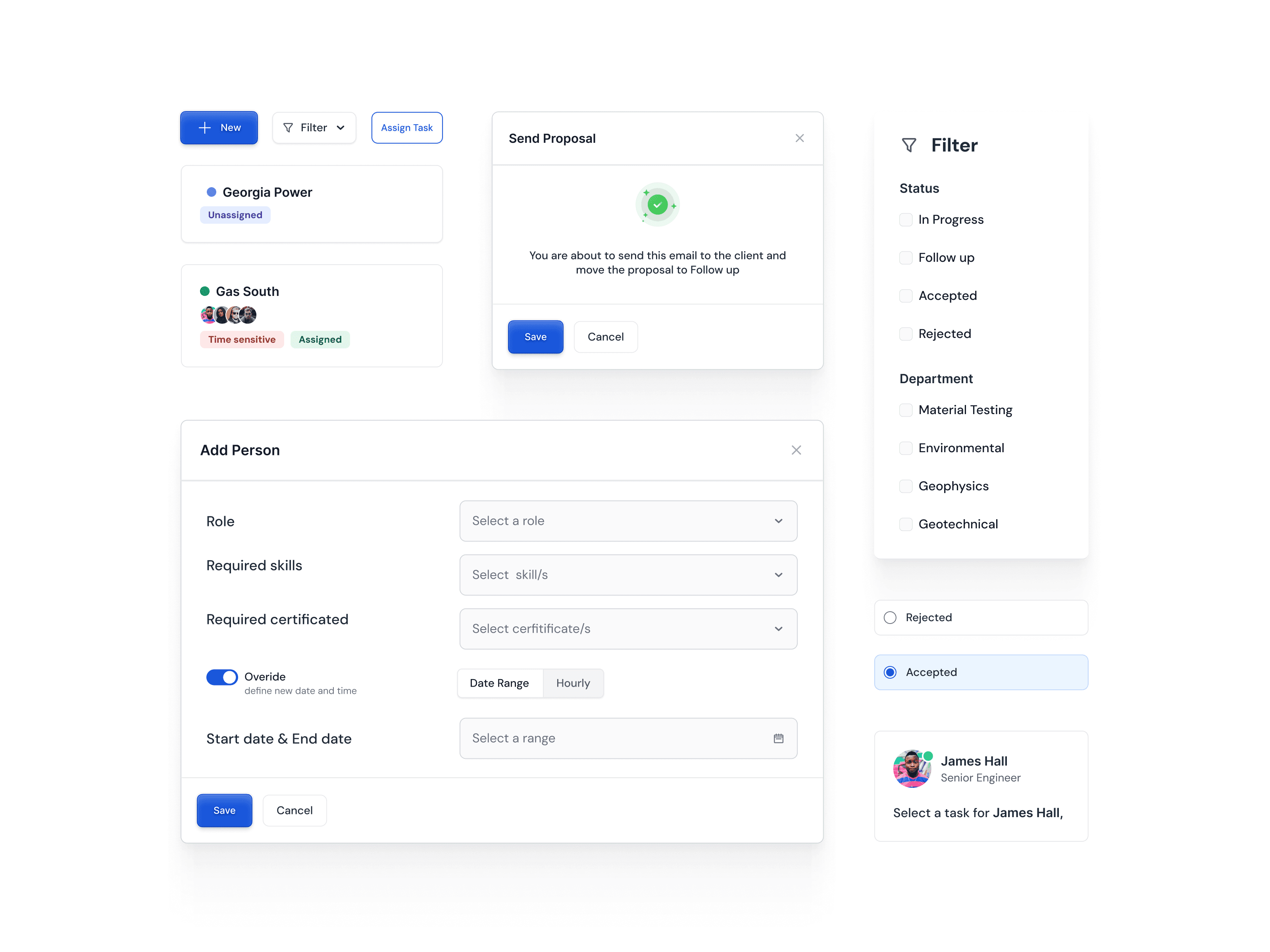
✦ Redesign version of Material Testing (filter)
UI Components
Results
The client was highly satisfied with the redesign, which led to a noticeable improvement in both user experience and business outcomes. I’ve designed 20+ screens in total for phase 1 of their release, setting the foundation for an enhanced user journey and smoother interactions across the platform.

